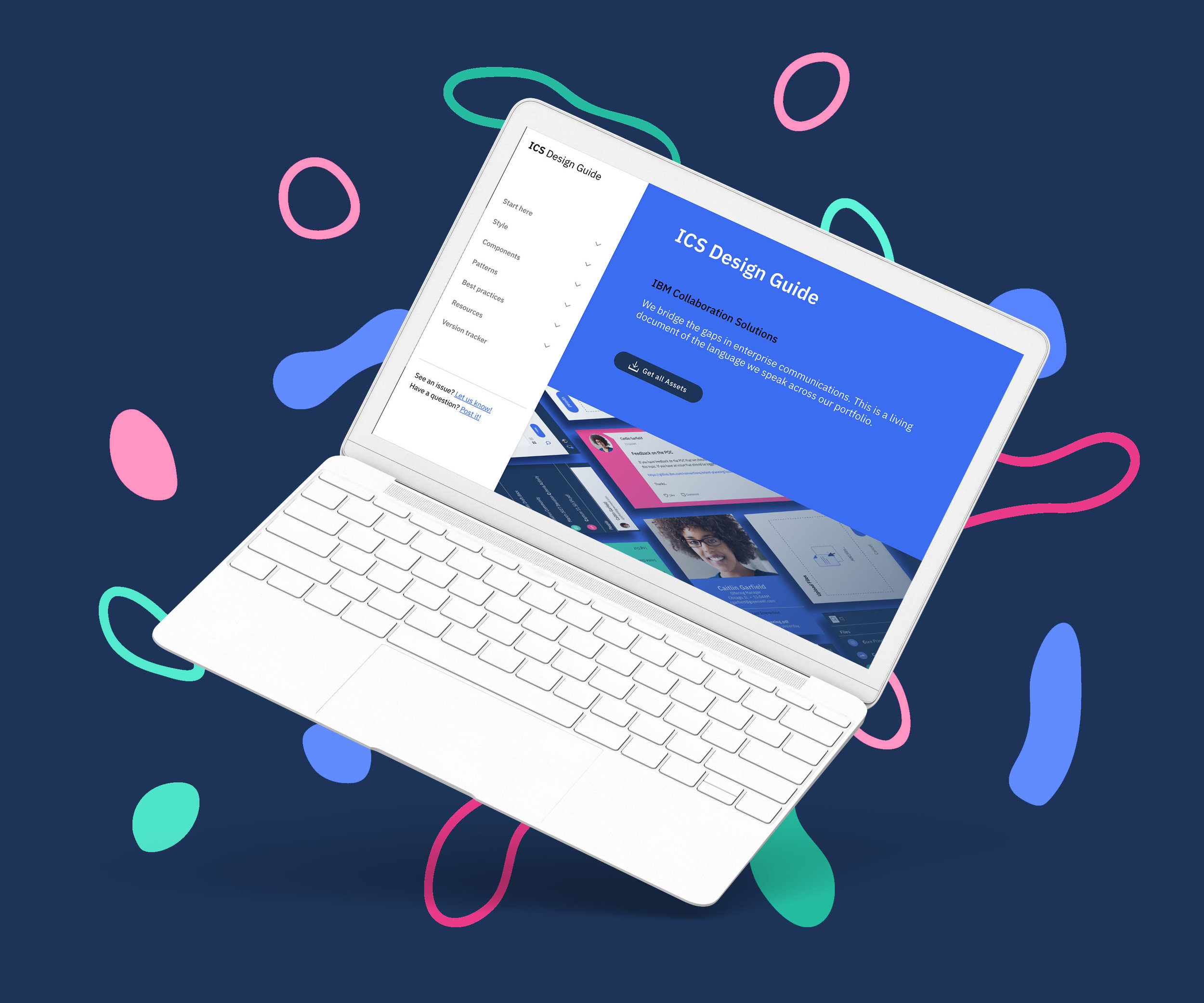
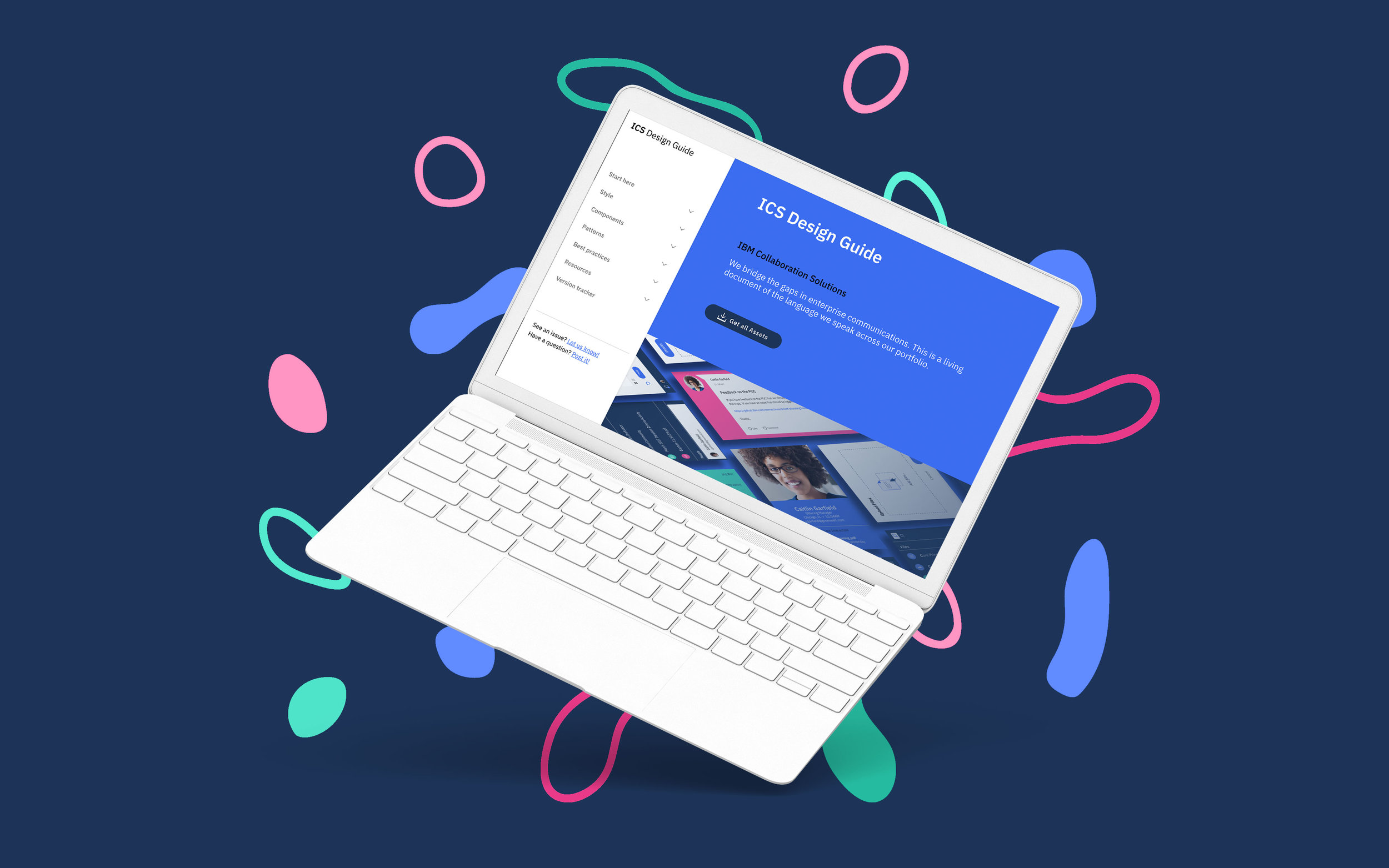
Design Guide
Problem Statement: As a designer/developer I need guidelines and resources for building future products.
Responsibilities: I worked as a Visual Designer, building the look and feel of the Design Guide website. I also helped define patterns and best practices for future designers and developers.
My team of designers, developers, researchers, and management.
STEP 1.
Collecting the research
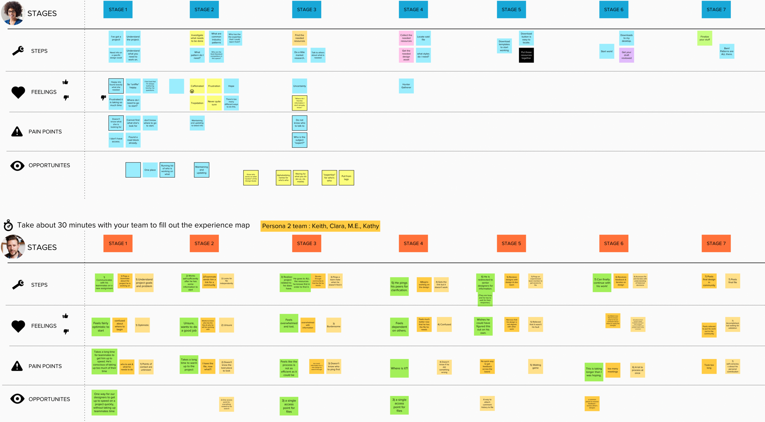
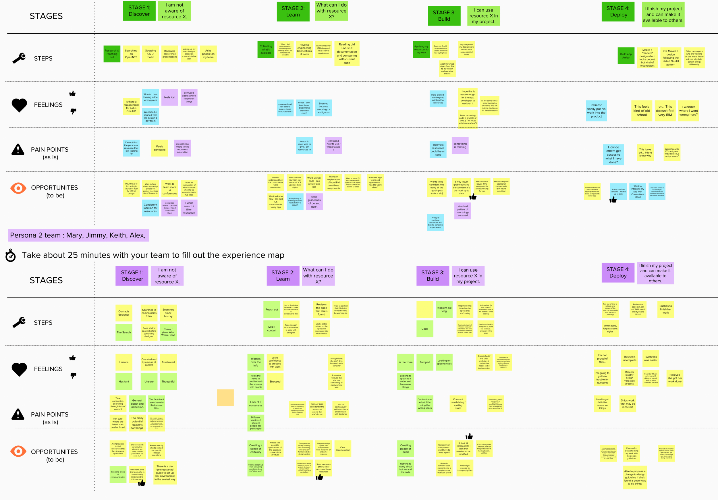
Once our problem statement was established, I ran a design thinking session for my team. During this exercise, we created empathy maps to help us gain a better understanding of our users.
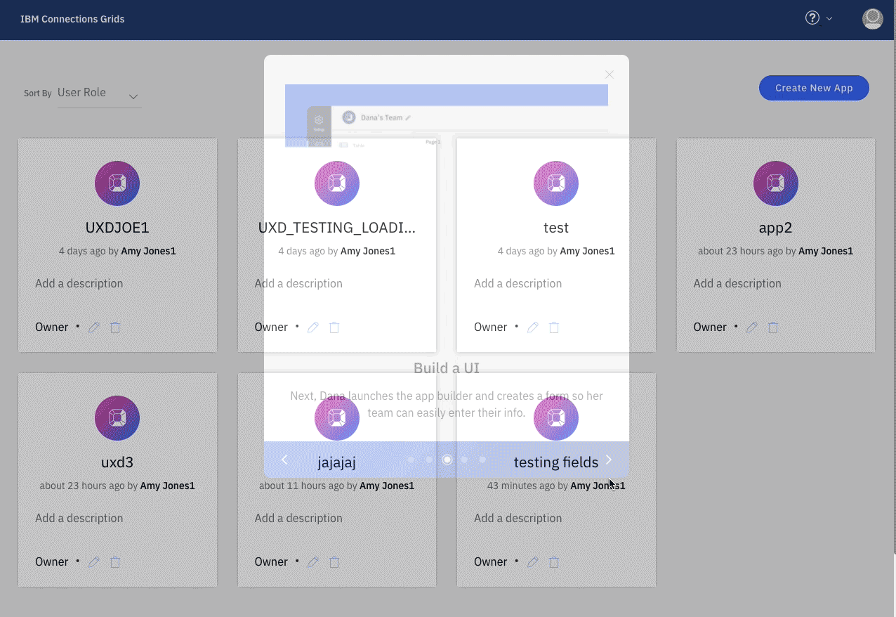
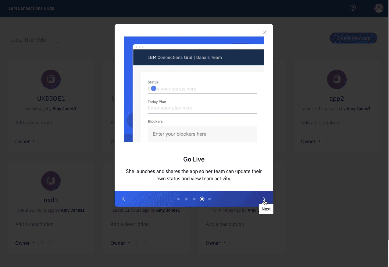
Click the images to see our personas in more detail :)
After building out our empathy maps, we went through an as-is scenario map* for each of our personas. My teammates and I mapped out the current user experience to find pain points and design opportunities that we could build from.
*As-is scenario maps serve to understand a user's holistic experience as he/she works to accomplish certain goals.
Establishing the design direction
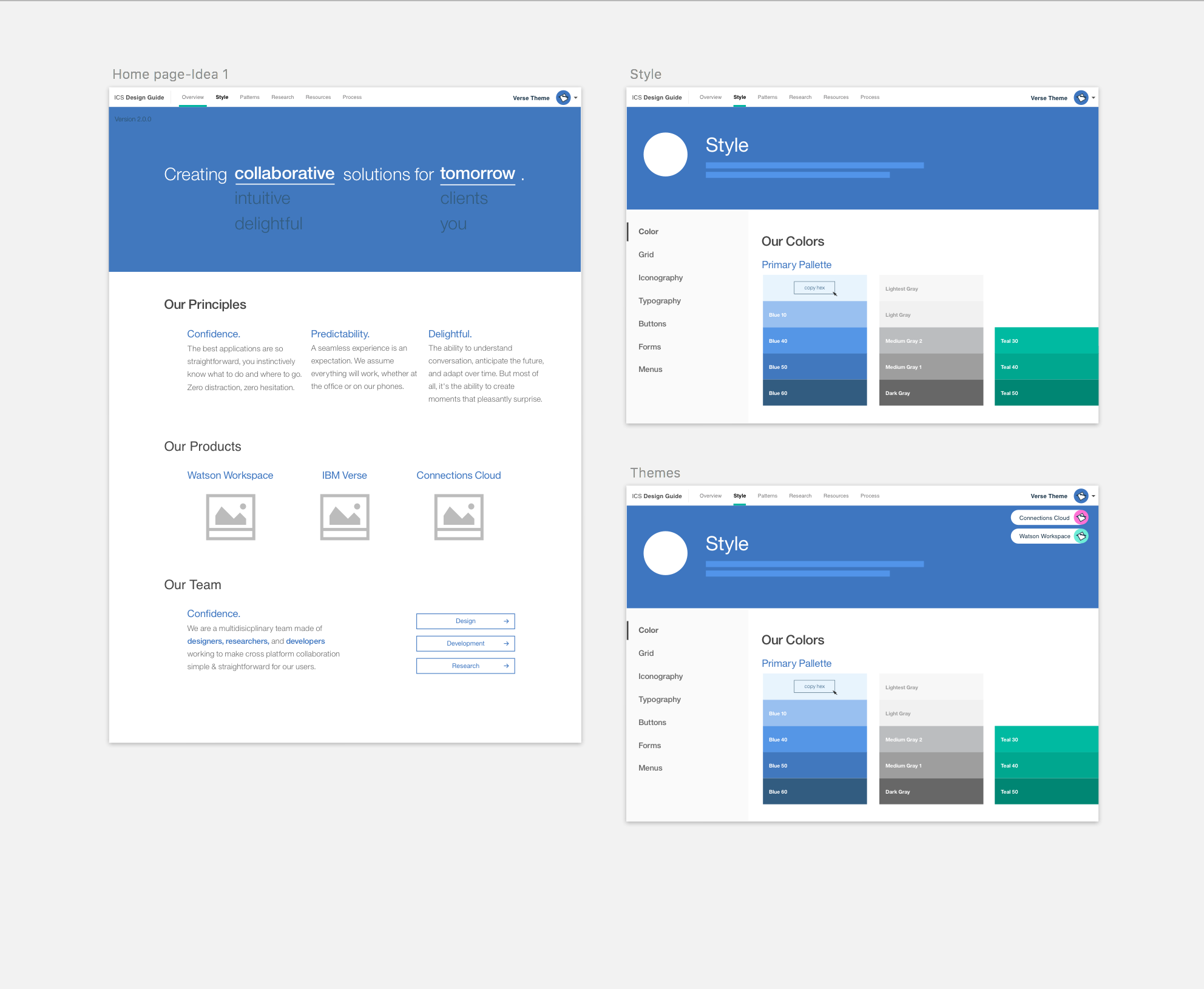
Gaining a better understanding of our user's pain points, my teammates and I began ideating on design concepts for the website. We each created a mood board to provide style direction for how the design guide should look and feel.
I focused on the organization, navigation, and visual design that I believed would fit our user needs.
My process quickly moved from pen and paper to mocking up low-fidelity wireframes on Sketch for the website. I reviewed the ideas with my design and development to see what would be feasible before moving forward to high-fidelity prototyping.
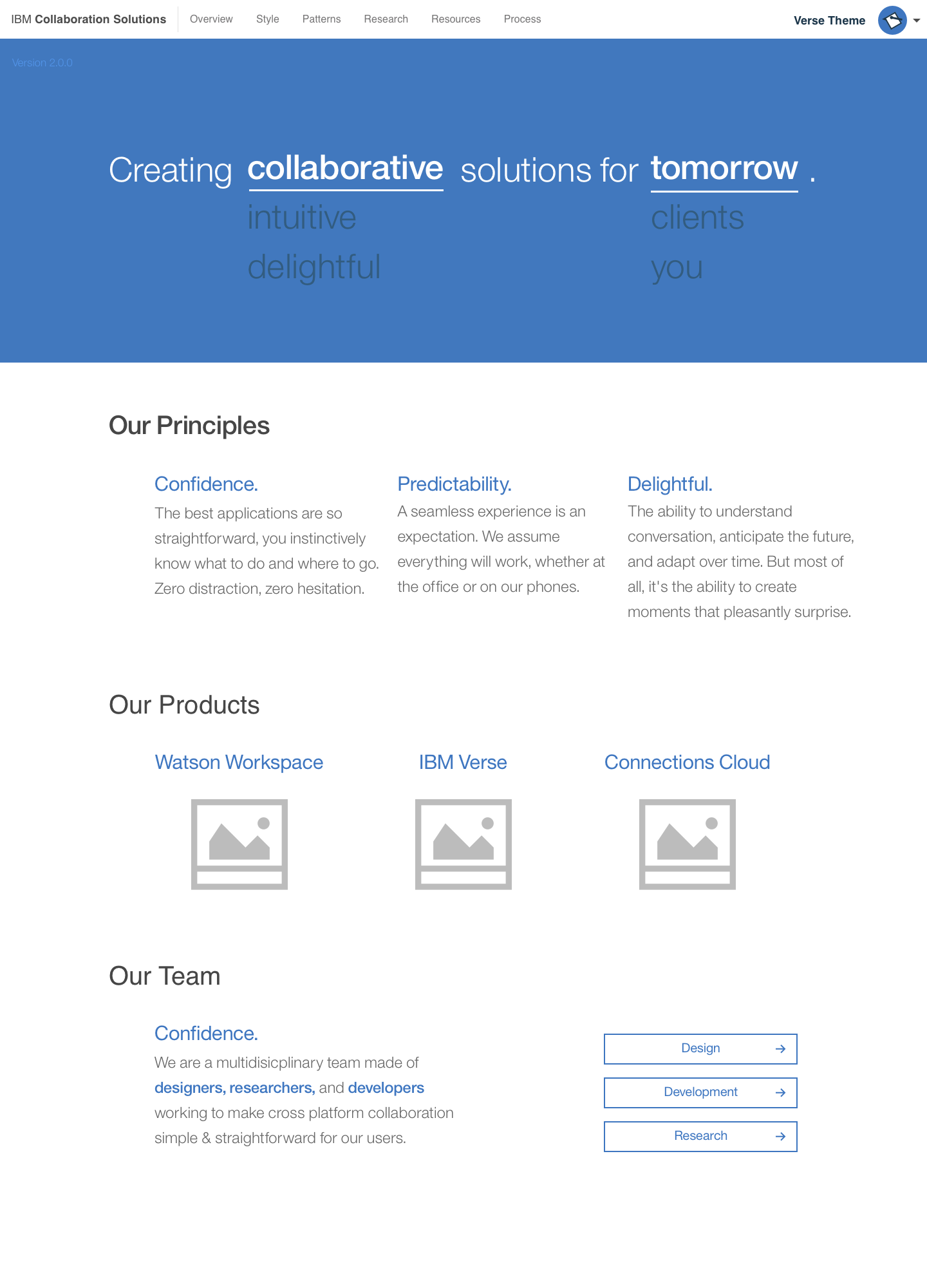
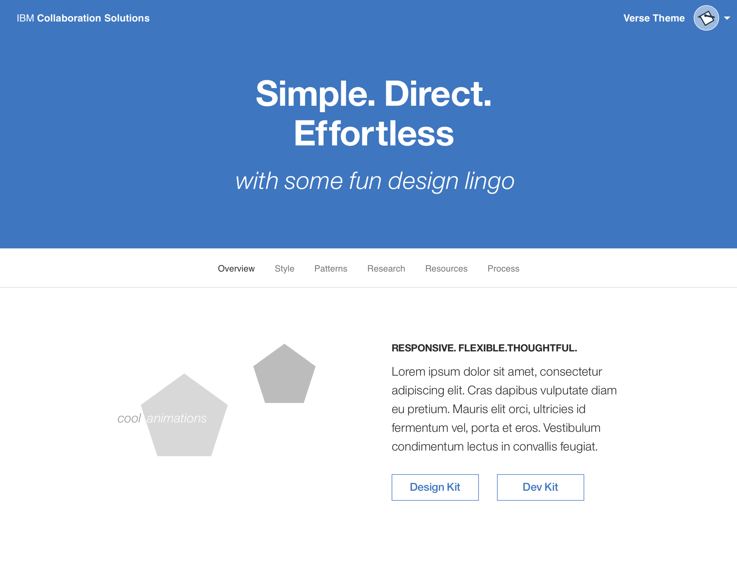
After low-fi exploration, my team and I moved into high-fidelity mockups to share with the development team (which you can see below). We explored the page hierarchy as well as navigation.
After deciding what style direction we would head, I began ideating. I begin most ideation with sketching, to allow me to get ideas out of my head. Putting my blue sky ideas on paper allows me to explore new concepts.
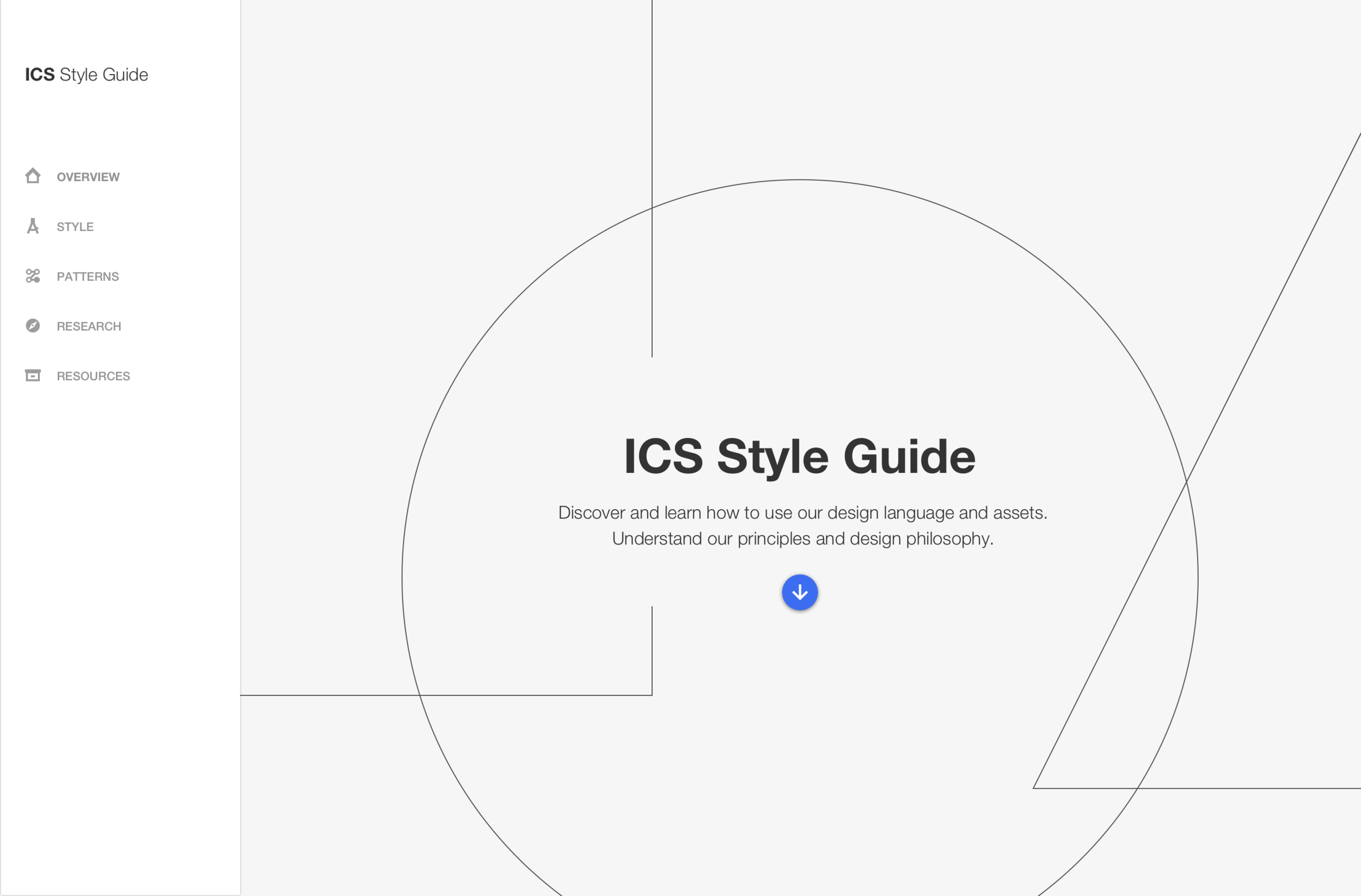
This sketch is just one idea I had for the landing page of the design guide. I was thinking about the grid, layout, and the content of the page.
Our core principles were defined to be: human, seamless, thoughtful, measurable, and evolving. These served as the north star for our designs.


STEP 2.
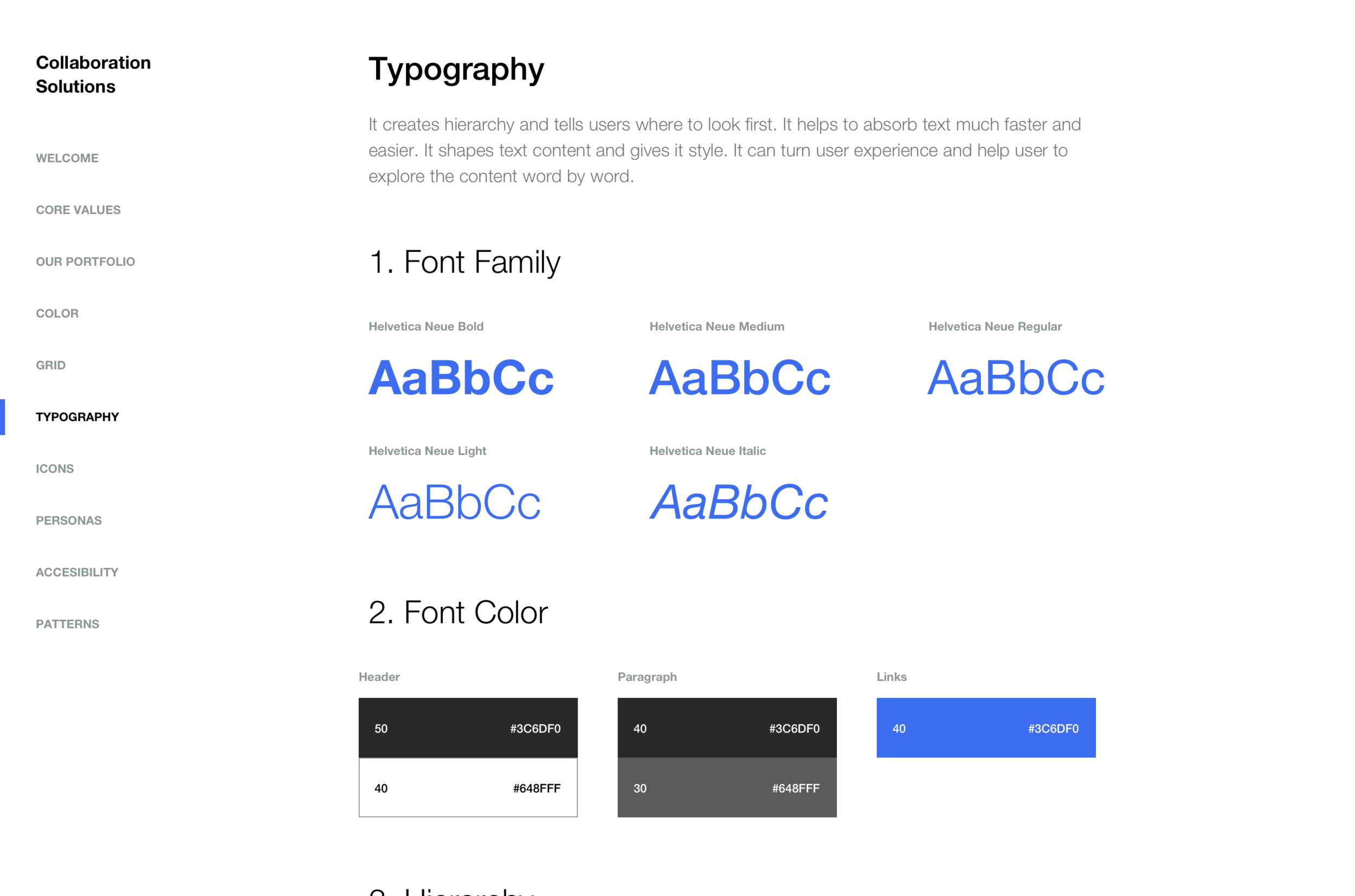
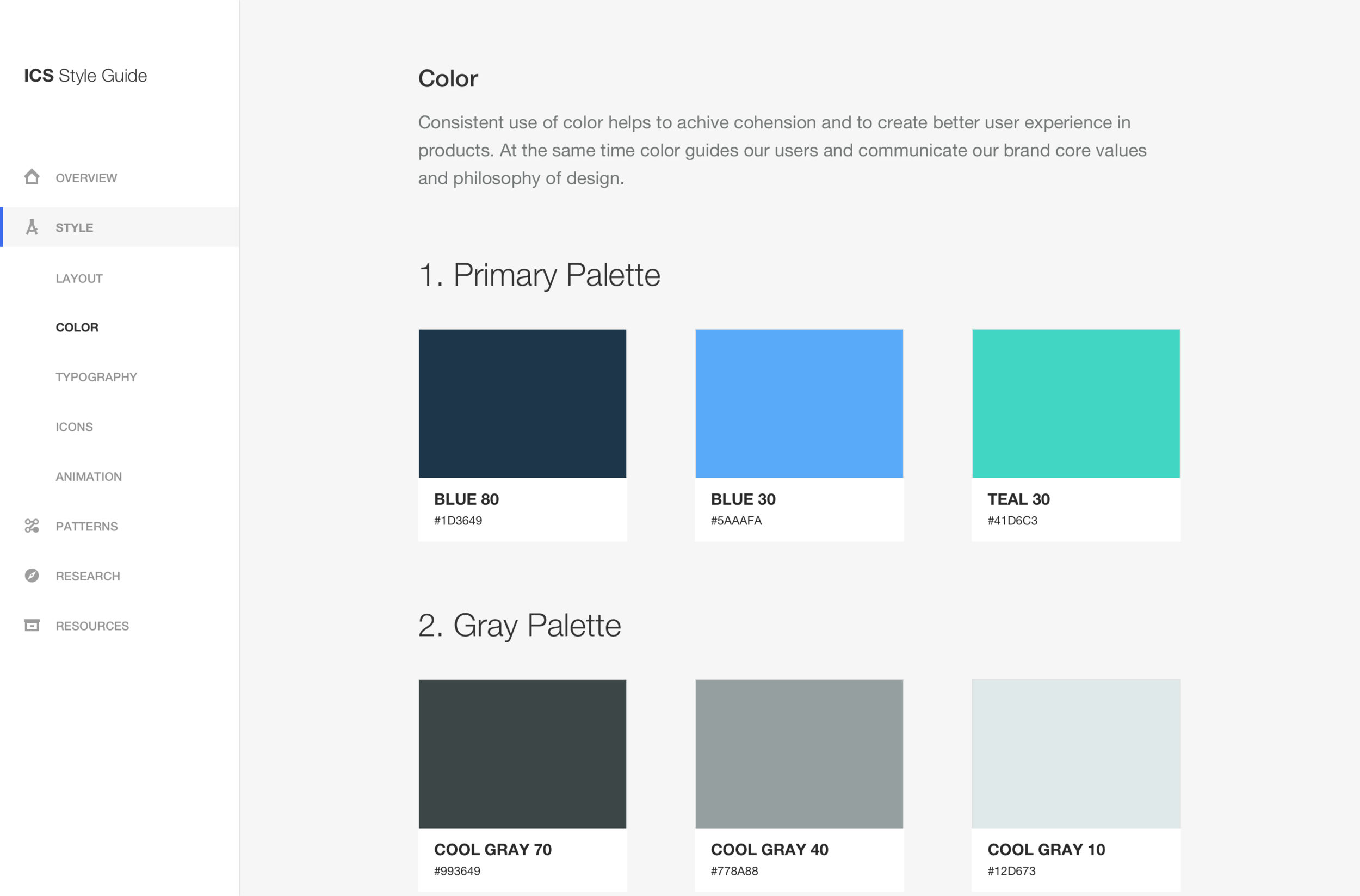
Building the components
Once our design and development foundation was built, my team began building components for the site. I worked directly with my development team to create scalable components that could be used by future developers. I also worked with my design team to create UX best practices for the components.
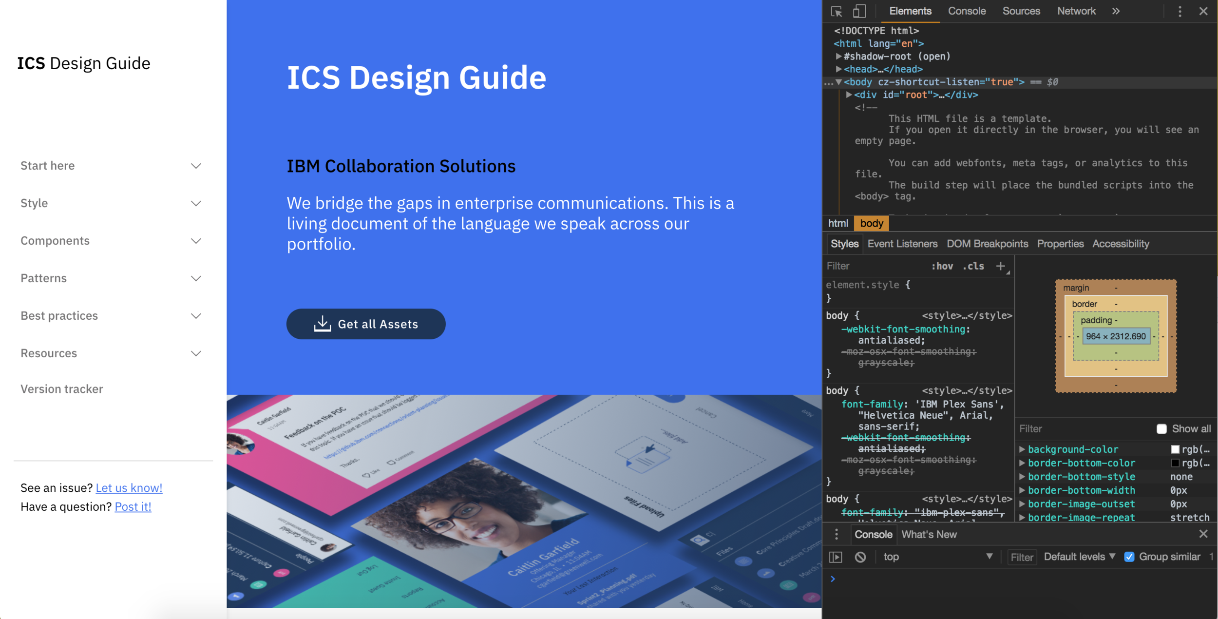
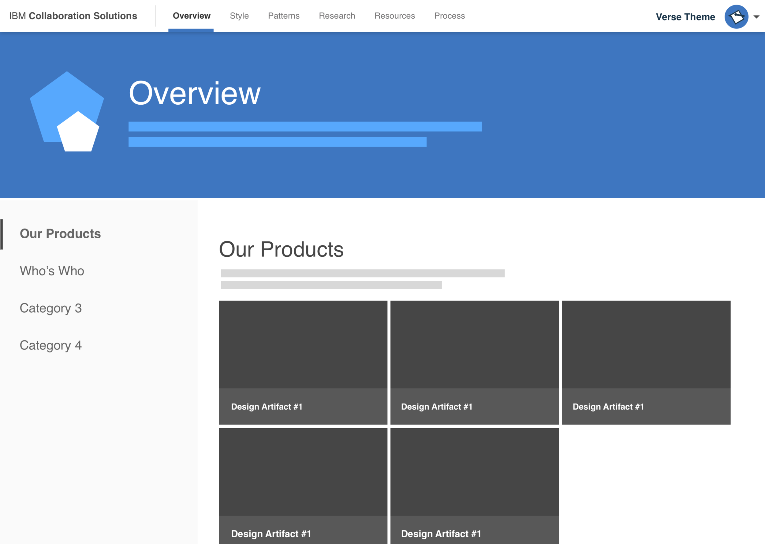
The framework for the current design site with our updated content and navigation.
Here are few of the components that I worked on...
Log in
I worked as both a visual designer and UX designer to build a new pattern for our log in experience. This piece involved a lot of collaboration with development as well as explorations on mobile/responsiveness.
You can see here a UX flow I created to understand how the log-in experience would be for different users.
Below are also some visual design explorations I created for the look and feel of the log-in page. We had to look at both web and mobile.
A look at the different use cases and flows for the log in experience our users are facing.


POC me and my FED teammate Adriana created.
Here's a proof-of-concept that me and a front-end developer created to show the micro-interactions and loading states for log in.
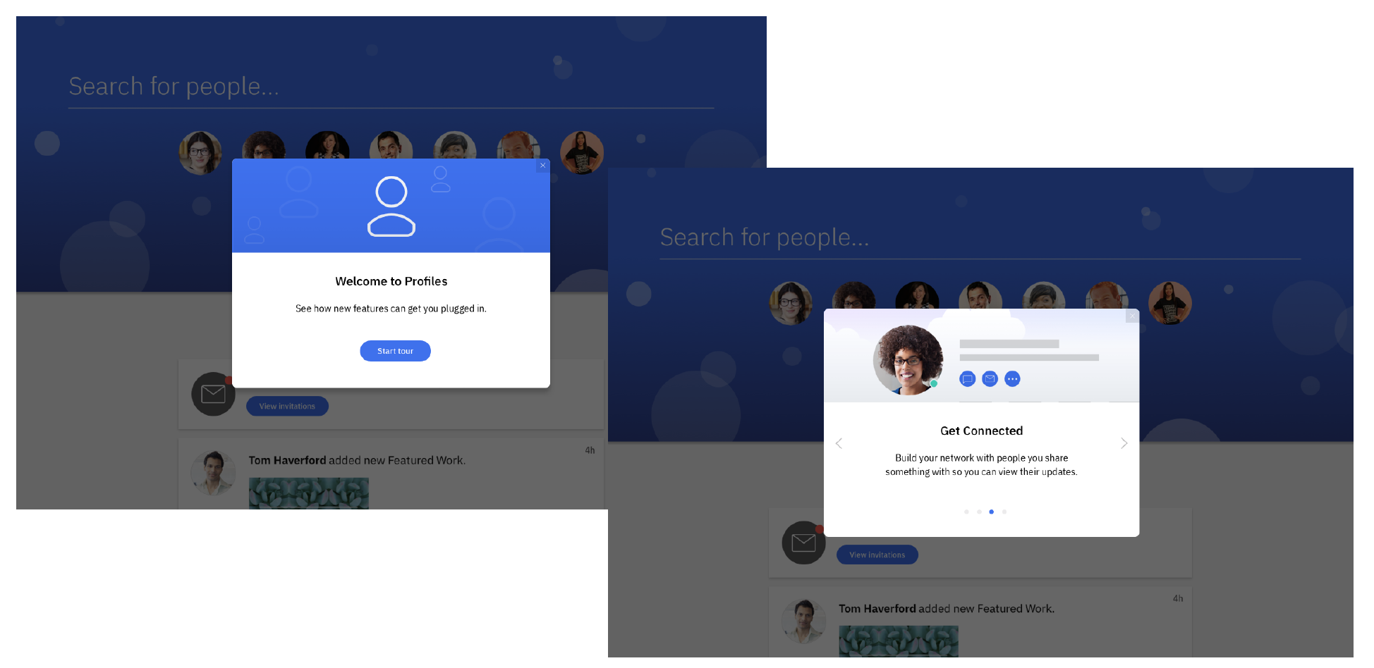
Tours Redesign
I worked with research and development to establish best practices for tours on our design guide. I also worked with both mobile and web designers to establish a visual design for tours.
Research + exploration
For the new tour pattern, I began by looking at the current user experience as well as doing a competitive analysis. After getting an idea for the style that I wanted for the tours, I began iterating on a few concepts.
Here's a look at the current user experience.
User Testing
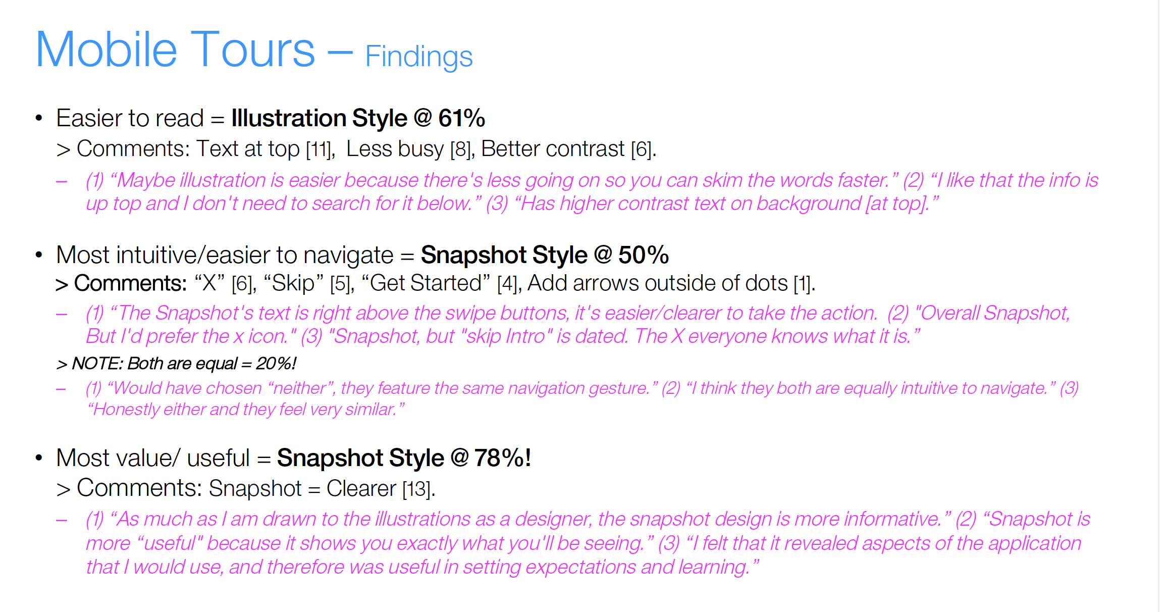
After establishing some design ideas on web and mobile, we ran user testing sessions for feedback. We tested with about 50 people (globally, both in-person and remote user testing) and ran the session over multiple days. For web, we reviewed two design concepts.
+ some explorations I did for a new visual style
The point of the testing was to gather preferences on the aspects of intuitiveness, usefulness, visual appeal, emotional impact, and overall usage preference.
Web Style A - Illustrative style
Web Style B - Snapshot style
We also ran sessions on the mobile designs (you can see some out the outcomes below).
Mobile Style A - Illustrative style
Mobile Style B - Snapshot style
“In the snapshot style you have a true visual indication on what you’re doing ie. a thing related to profiles/users. If you remove the text you can still understand the goal. ”
Design in context
Since we had a clear preference through user testing, we knew that we would run with the illustration style and spotlight for the web tour. I worked closely with the development team to mock up prototypes in the UI to see how the tour would function. Also, I tested the accessibility of the tours, looking at different vision/hearing disabilities as well as testing keyboard controls. I created many UX specs to ensure the tour would be for all user types.
Tool tips for vision impaired users
Visual design specs for development